


Logo Exploration
I explored a range of directions to capture the energy of automotive culture while keeping the identity clean and modern. Early concepts explored motion cues, speed lines, water symbolism, and spark details inspired by the car wash environment.
These explorations helped define the visual direction before refining the mark into a simpler, more confident wordmark.


Final Logo
The final mark centers on a bold, geometric wordmark designed for clarity and confidence. By removing decorative elements explored in earlier concepts, the identity prioritizes legibility, scalability, and long-term adaptability.

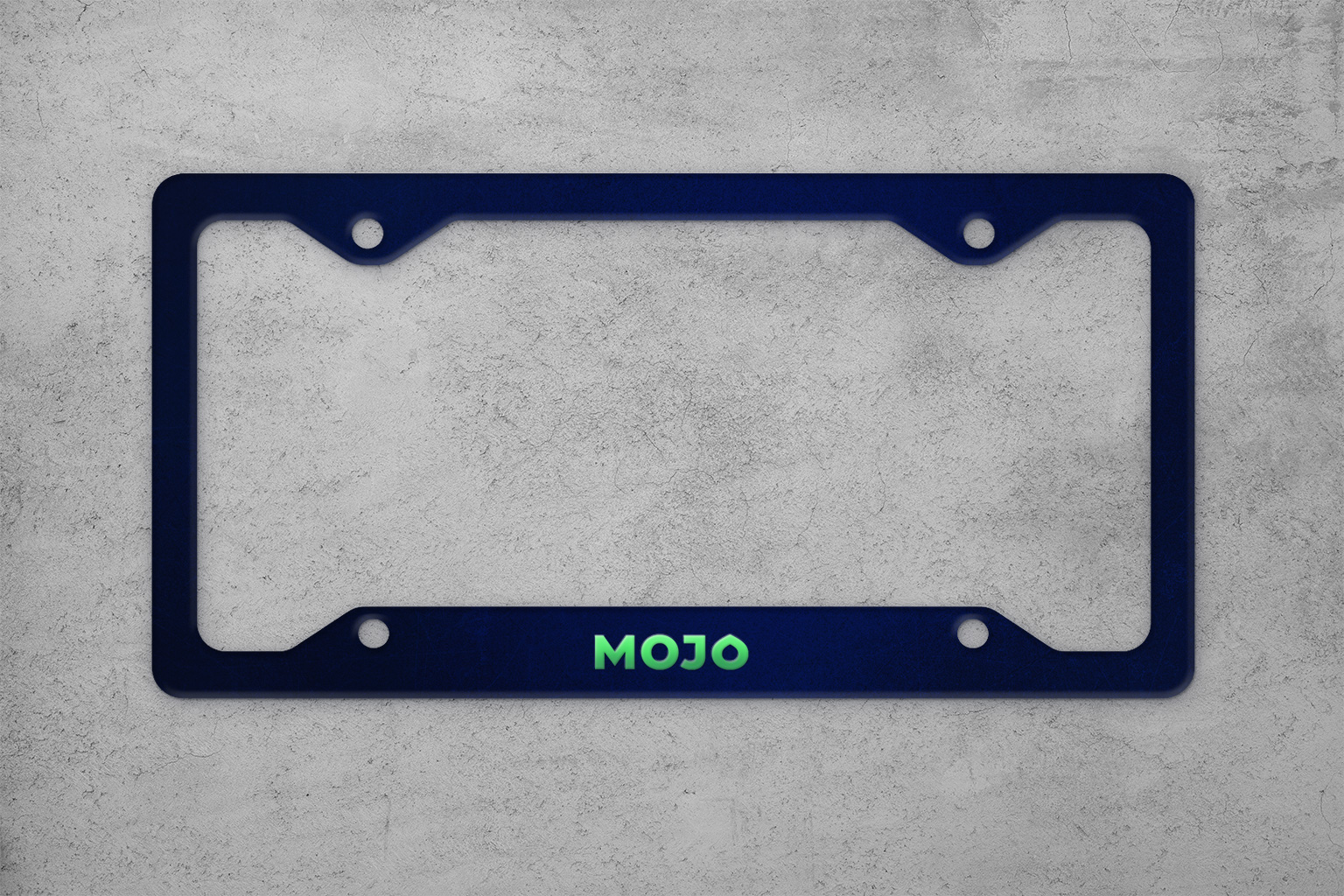
Color Palette
The primary green was chosen for its high visibility and distinctive presence. Paired with deep navy, the palette balances energy with a sense of precision, creating a system that feels both bold and controlled.


My role
While at Gale Partners, I developed several logo directions for MOJO. The selected wordmark was my design and became the final logo for the brand.
I also contributed to the development of the color palette during the early stages of the identity.